
您是否曾经被要求向WordPress网站的<heade…
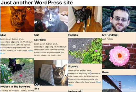
一段时间以来,类似Pinterest的帖子网格显示一直是WordPress博客索引页面的流行设计。它之所以受欢迎,不仅是因为它模仿了流行的社交媒体网站的外观,而且还因为它可以充分利用屏幕上的空间。在WordPress博客索引上,它允许每个帖子预览达到其自然所需的大小,而不会留下额外的空间。
在本教程中,我将向您展示如何使用流行的Masonry JavaScript库为博客索引以及主题的存档页面创建级联网格布局。我将解决您需要进行移动优化的一些问题以及如何解决这些问题。
注意:这是高级教程,适合那些喜欢编辑WordPress主题并且具有足够的HTML / CSS知识的人。
步骤1:将必要的库添加到您的主题
更新:WordPress 3.9现在包括最新版本的Masonry。
首先,您需要使用以下代码将Masonry加载到主题中:
if(! function_exists('slug_scripts_masonry') ) :if( ! is_admin() ) :functionslug_scripts_masonry() { wp_enqueue_script('masonry'); wp_enqueue_style('masonry’, get_template_directory_uri().'/css/’);}add_action( 'wp_enqueue_scripts', 'slug_scripts_masonry');endif; //! is_admin()endif; //! slug_scripts_masonry exists
此代码仅加载砖石并将其提供给主题的模板文件(请参阅有关如何在WordPress中正确添加JavaScript和样式的指南)。还要注意,我们都没有将jQuery作为依赖项添加。Masonry 3的优点之一是它不需要jQuery,但可以与它一起使用。以我的经验,在不使用jQuery的情况下初始化Masonry更为可靠,并且可以跳过加载jQuery的可能性,这可以帮助解决页面加载时间和兼容性问题。
步骤2:初始化Javascript
下一个功能设置砌筑,定义将与之配合使用的容器,并确保一切按正确顺序进行。石工需要计算页面上每个项目的大小,以便动态布局其网格。我在许多浏览器中都遇到了Masonry的问题,就是Masonry会错误地计算加载缓慢图像的物品的高度,从而导致物品重叠。解决方案是使用imagesLoaded来防止Masonry在加载所有图像之前计算布局。这样可以确保正确调整大小。
这是将在页面页脚中输出初始化脚本的函数和操作:
if( ! function_exists( 'slug_masonry_init')) :functionslug_masonry_init() { ?><script> //set the container that Masonry will be inside of in a var varcontainer = document.querySelector('#masonry-loop'); //create empty var msnry varmsnry; // initialize Masonry after all images have loaded imagesLoaded( container, function() { msnry = newMasonry( container, { itemSelector: '.masonry-entry' }); });</script><?php }//add to wp_footeradd_action( 'wp_footer', 'slug_masonry_init');endif; // ! slug_masonry_init exists
通过内嵌注释逐步解释该功能。Javascript函数的作用是告诉Masonry在具有id“ masonry-loop”的容器内查找“ masonry-entry”类的项目,并仅在加载图像后才计算网格。我们使用querySelector设置外部容器,使用itemSelector设置内部容器。
第2步:创建砌体环
与其直接将Masonry的HTML标记添加到模板中,不如为它创建一个单独的模板部分。创建一个名为“ content-masonry.php”的新文件,并将其添加到您的主题中。这将允许您将Masonry循环添加到所需的任意数量的不同模板中。
在新文件中,您将添加以下代码。标记类似于您在任何内容预览中通常看到的标记。您可以根据需要进行任何修改,只需确保最外面的元素具有在最后一步中设置为itemSelector的“砌体进入”类即可。
<article class="masonry-entry"id="post-<?php the_ID(); ?>"<?php post_class(); ?> ><?php if( has_post_thumbnail() ) : ?> <div class="masonry-thumbnail"> <a href="<?php the_permalink(' ') ?>"title="<?php the_title(); ?>"><?php the_post_thumbnail('masonry-thumb'); ?></a> </div><!--.masonry-thumbnail--><?php endif; ?> <div class="masonry-details"> <h5><a href="<?php the_permalink(' ') ?>"title="<?php the_title(); ?>"><span class="masonry-post-title"> <?php the_title(); ?></span></a></h5> <div class="masonry-post-excerpt"> <?php the_excerpt(); ?> </div><!--.masonry-post-excerpt--> </div><!--/.masonry-entry-details --> </article><!--/.masonry-entry-->
该标记的每个部分都有类,因此您可以添加标记以匹配您的主题。我喜欢在.masonry-entry中添加一个漂亮的,略圆的边框。另一个不错的选择是.masonry-entry没有边界,但要给它一个阴影。当帖子缩略图一直延伸到容器的边框时,这看起来特别好,这可以通过在所有方向上给.masonry-thumbnail设置边距和填充为0来实现。您将需要在主题的css目录中的名为masonry.css的文件中添加所有这些样式。
步骤3:将砌体环添加到模板
现在我们有了模板部分,您可以在您喜欢的主题的任何模板中使用它。如果您不希望将它用于类别存档,则可以将其添加到index.php,而不是category.php。如果只希望在主题的主页上使用它,则当它设置为显示博客文章时,可以在home.php中使用它。无论您选择什么地方,都需要将循环包装在ID为“ masonry-loop”的容器中,然后使用get_template_part()将模板部分添加到循环中。确保在while(have_posts())之前启动砌体循环容器。
例如,以下是二十十三的index.php的主循环:
<?php if( have_posts() ) : ?>
<?php /* The loop */?> <?php while( have_posts() ) : the_post(); ?> <?php get_template_part( 'content', get_post_format() ); ?> <?php endwhile; ?>
<?php twentythirteen_paging_nav(); ?>
<?php else: ?> <?php get_template_part( 'content', 'none'); ?><?php endif; ?>
在这里,它被修改以使用我们的砌体循环:
<?php if( have_posts() ) : ?><div id="masonry-loop"> <?php /* The loop */?> <?php while( have_posts() ) : the_post(); ?> <?php get_template_part( 'content', 'masonry'?> <?php endwhile; ?></div><!--/#masonry-loop--> <?php twentythirteen_paging_nav(); ?>
<?php else: ?> <?php get_template_part( 'content', 'none'); ?><?php endif; ?>
步骤4:设置砌体项目的响应宽度
您可以通过多种方式设置每个砌体项目的宽度。初始化砌体时,可以使用多个像素设置宽度。我不喜欢这样做,因为我使用响应式主题,并且它需要一些复杂的媒体查询才能在小屏幕上正确显示内容。对于自适应设计,我发现最好的方法是根据要连续多少项设置.masonry-entry的宽度值并设置一个百分比,然后让Masonry为您完成其余的数学运算。
所需要做的就是用100除以您要在主题的style.css中的简单条目中设置百分比的项目数。例如,如果您希望每行有四个项目,则可以在masonry.css文件中执行以下操作:
.masonry-entry{width:25%}
第5步:移动优化
我们可以在这里停下来,但是我认为最终结果在小的手机屏幕上无法正常运行。使用桌面上的新Masonry网格对主题的外观感到满意后,请在手机上签出。如果您对手机上的外观不满意,则需要做一些工作。
我认为手机屏幕上没有足够的空间容纳我们添加到内容砌体模板部分的所有内容。您可以使用两种好的解决方案来缩短电话摘录或完全跳过摘录。这是一个额外的功能,您可以将其添加到主题的functions.php中。因为我认为这些问题在平板电脑上不是问题,所以在本节的所有示例中,我都使用了很棒的Mobble插件来仅在手机而非平板电脑上进行更改。我还在使用Mobble之前先检查它是否处于活动状态,必要时还可以使用WordPress中内置的更通用的移动检测功能wp_is_mobile。
if(! function_exists('slug_custom_excerpt_length') ) :functionslug_custom_excerpt_length( $length) { //set the shorter length once $short= 10; //set long length once $long= 55; //if we can only set short excerpt for phones, else short for all mobile devices if(function_exists( 'is_phone') { if( is_phone() ) { return$short; } else{ return$long; } } else{ if( wp_is_mobile() ) { return$short; } else{ return$long; } }}add_filter( 'excerpt_length', 'slug_custom_excerpt_length', 999 );endif; // ! slug_custom_excerpt_length exists
如您所见,我们首先将长摘录长度和短摘录长度存储在变量中,因为我们将使用这些值两次,并且希望以后可以将它们从一个位置更改。从那里我们测试是否可以使用Mobble的is_phone()。如果是这样,我们设置电话的简短摘录,如果不是,则设置长摘录。之后,我们执行相同的基本操作,但是使用wp_is_mobile,如果无法使用is_phone(),它将影响所有移动设备。希望永远不要使用此功能的else部分,但是最好有一个备份,以防万一。一旦设置了摘录长度逻辑,它就归结为将函数挂接到excerpt_length过滤器。
缩短摘录是一种选择,但是我们也可以通过一个简单的过程完全消除它。这是内容砌筑的新版本,电话中省略了全部摘录部分:
<article class="masonry-entry"id="post-<?php the_ID(); ?>"<?php post_class(); ?> ><?php if( has_post_thumbnail() ) : ?> <div class="masonry-thumbnail"> <a href="<?php the_permalink(' ') ?>"title="<?php the_title(); ?>"><?php the_post_thumbnail('masonry-thumb'); ?></a> </div><!--.masonry-thumbnail--><?php endif; ?> <div class="masonry-details"> <h5><a href="<?php the_permalink(' ') ?>"title="<?php the_title(); ?>"><span class="masonry-post-title"> <?php the_title(); ?></span></a></h5> <?php //put the excerpt markup in variable so we don't have to repeat it multiple times. $excerpt= '<div class="masonry-post-excerpt">'; $excerpt.= the_excerpt(); $excerpt.= '</div><!--.masonry-post-excerpt-->';//if we can only skip for phones, else skip for all mobile devices if(function_exists( 'is_phone') { if( ! is_phone() ) { echo$excerpt; } } else{ if( ! wp_is_mobile() ) { echo$excerpt; } } ?> </div><!--/.masonry-entry-details --> </article><!--/.masonry-entry-->
这次我们正在测试以查看是否不在电话/移动设备上,如果是,我们返回循环的摘录部分。如果我们在电话/移动设备上,我们什么也不做。
您可能想做的另一件事是增加移动设备上的砌体项目的宽度,从而减少连续的数量。为此,我们将基于设备检测将不同的内联样式添加到标题中。由于此函数使用wp_add_inline_styles,因此它将依赖于特定的样式表。在这种情况下,我使用masonry.css(您可能需要)来使您的砌体样式保持独立。如果您最终不使用它,则可以使用另一个已经注册的样式表中的句柄。
if( ! function_exists ( 'slug_masonry_styles') ) :functionslug_masonry_styles() { //set the wide width $wide= '25%'; //set narrow width $narrow= '50%'; /**Determine value for $width**/ //if we can only set narrow for phones, else narrow for all mobile devices if(function_exists( 'is_phone') { if( is_phone() ) { $width= $narrow; } else{ $width= $wide; } } else{ if( wp_is_mobile() ) { $width= $narrow; } else{ $width= $wide; } } /**Output CSS for .masonry-entry with proper width**/ $custom_css= ".masonry-entry{width: {$width};}"; //You must use the handle of an already enqueued stylesheet here. wp_add_inline_style( 'masonry', $custom_css);}add_action( 'wp_enqueue_scripts', 'slug_masonry_styles');endif; // ! slug_masonry_styles exists
此函数使定制样式表无效,然后使用现在应该非常熟悉的逻辑为width设置一个值。之后,我们通过将width的值传递给带有{$ width}的CSS常规外观位来创建$ custom_css变量。之后,只要使用Masonry样式表,我们就使用wp_add_inline_style告诉WordPress在标头中打印内联样式,然后将整个函数挂接到wp_enqueue_scripts上,然后完成。
如果您选择将Masonry样式合并到现有样式表中,请确保将该样式表的句柄与wp_add_inline_style一起使用,否则将不包括内联样式。我喜欢使用wp_add_inline_style,因为我通常将动作钩子包装在有条件的情况下使砌体入队,因此仅在需要时才添加它。例如,如果我仅在博客索引和存档页面上使用Masonry,则可以这样做:
if( is_home() || is_archive() ) { add_action( 'wp_enqueue_scripts', 'slug_scripts_masonry');}
最后的几个例子应该在您的大脑中打开其他一些想法。例如,您可以使用类似的逻辑在移动设备上完全跳过石工。wp_add_inline_style()也是一种较少使用但非常有用的函数,因为它允许您基于任何类型的条件以编程方式设置不同的样式。它不仅使您能够根据设备检测来根本性地更改任何元素的样式,而且更改还可能基于所使用的模板,甚至无论用户是否登录也都可以。
希望您能看到我正在做出的这些不同变化,以此来发挥创造力。石工和类似的级联网格系统已经流行了一段时间,因此该流行思想有了新的转折。在评论中向我们展示在WordPress主题中使用Masonry时想出的最酷的方法。
相关内容